by Clark Newell
December 9th 2021


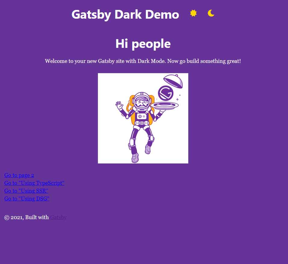
Gatsby Dark Demo by Clark Newell
TLDR: Implementing dark mode on a Gatsby site can be amazingly easy! This post gives detailed instructions in four steps with code blocks. Or, follow the link at the beginning of the post to simply fork the demo repo from GitHub.
The Basics
Building a site with the Gatsby framework requires some knowledge of JavaScript and the React library.
- This demo is based on the default starter which can be found here.
- A working demo of this post is found here.
- You can also fork the repo of this demo here.
The beauty of using the Gatsby framework to manage your React application is the rich ecosystem of plugins that are available. Just about any node package available for React will work with Gatsby, however, an additional plugin built specifically to interface with the framework is usually needed as well.
Step One
Once you have the Gatsby CLI installed in your terminal, spin up the default starter. You will need to import icons to serve as your light and dark mode buttons. In the demo repo above I am using SVGs for this purpose. Note that if you are using SVGs with Gatsby, you guessed it, a plugin is required. If you're using SVG icons as your buttons you must install this from the CLI:
npm install gatsby-plugin-react-svgAnytime a Gatsby plugin is installed, you must also add this plugin to your gatsby-config.js file. This particular plugin is required to be an object with options and a rule to include assets. Add this to your gatsby-config.js file:
{
  resolve: `gatsby-plugin-react-svg`,
  options: {
    rule: {
      include: /assets/
    }
  }
},
At the bottom of the layout.css file, add a class "mode-icons" for color fill, size and margins like this:
.mode-icon {
  fill: #ffd700;
  height: 1.25rem;
  width: 1.25rem;
  margin-top: 0.5rem;
  margin-left: 2rem;
  cursor: pointer;
}

/*In this code editor, fill is rendering with lighter font, which indicates this attribute is potentially not supported by outdated browsers*/
Next, import Sun and Moon icons from assets into header.js (all of the special SVG steps can be ignored if you instead choose to use PNG icons). Add SunIcon and MoonIcon to your header component after the title div. An example of the code needed to do this in header.js can be found after step two below.
Step Two
Now is the time to install the "use-dark-mode" plugin by Donovan West from NPM along with it's corresponding gatsby plugin, "gatsby-plugin-use-dark-mode" like this from the CLI:
npm install use-dark-mode gatsby-plugin-use-dark-modeOf course, "gatsby-plugin-use-dark-mode" should also be added to gatsby-config.js. I would add this plugin after "gatsby-plugin-sharp":
plugins: [
    `gatsby-plugin-react-helmet`,
    `gatsby-plugin-image`,
    {
      resolve: `gatsby-source-filesystem`,
      options: {
        name: `images`,
        path: `${__dirname}/src/images`,
      },
    },
    `gatsby-transformer-sharp`,
    `gatsby-plugin-sharp`,
    `gatsby-plugin-use-dark-mode`,
    {
      resolve: `gatsby-plugin-react-svg`,
      options: {
        rule: {
          include: /assets/
        }
      }
    },
    {
      resolve: `gatsby-plugin-manifest`,
      options: {
        name: `gatsby-starter-default`,
        short_name: `starter`,
        start_url: `/`,
        background_color: `#663399`,
        // This will impact how browsers show your PWA/website
        // https://css-tricks.com/meta-theme-color-and-trickery/
        // theme_color: `#663399`,
        display: `minimal-ui`,
        icon: `src/images/gatsby-icon.png`, // This path is relative to the root of the site.
      },
    },
    // this (optional) plugin enables Progressive Web App + Offline functionality
    // To learn more, visit: https://gatsby.dev/offline
    // `gatsby-plugin-offline`,
  ],
Step Three
Now, the following steps need to be implemented into the header.js file:
- Import useDarkMode from "use-dark-mode"
- Update the header function with curly brackets and return the JSX in parenthesis so that useDarkMode can be invoked inside the header function
- Create a const darkMode variable for useDarkMode and set to false
- Include the "mode-icons" class on SunIcon and MoonIcon to get the css attributes
- Add an onClick function to the SunIcon that disables darkMode
- Add an onClick function to the MoonIcon that enables darkMode
- Add alternative text to the mode icons for assistive technology
Now your header.js file will look like this:
import * as React from "react"
import PropTypes from "prop-types"
import { Link } from "gatsby"
import useDarkMode from "use-dark-mode"

import SunIcon from "../assets/sun.inline.svg"
import MoonIcon from "../assets/moon.inline.svg"

const Header = ({ siteTitle }) => {
  const darkMode = useDarkMode(false)

  return (
    <header
      style={{
        background: `rebeccapurple`,
        marginBottom: `1.45rem`,
      }}
    >
      <div
        style={{
          margin: `0 auto`,
          maxWidth: 960,
          padding: `1.45rem 1.0875rem`,
          display: "flex",
          justifyContent: "center",
        }}
      >
        <h1 style={{ margin: 0 }}>
          <Link
            to="/"
            style={{
              color: `white`,
              textDecoration: `none`,
            }}
          >
            {siteTitle}
          </Link>
        </h1>
        <div>
          <SunIcon  className="mode-icon"
                    onClick={() => {
                        darkMode.disable()
                    }}
                    alt='sun icon for light mode'
          />
        </div>
        <div>
          <MoonIcon className="mode-icon"
                    onClick={() => {
                        darkMode.enable()
                    }}
                    alt='moon icon for dark mode'
          />
        </div>
      </div>
    </header>
  )
}

Header.propTypes = {
  siteTitle: PropTypes.string,
}

Header.defaultProps = {
  siteTitle: ``,
}

export default Header
As a side note, I did also add the "display: flex", and "justifyContent: center" attributes to the header just because I personally like how it looked in the deployed demo.
Step Four
Lastly there are just a few more changes to make to the layout.css file.
- Remove "color" from the body selector
- Below the main body selector, create another "body" selector with a class of "light-mode"
- In the "body.light-mode" selector, add color "#000" to keep the font color black
- Create another "body" selector with a class of "dark-mode"
- In the "body.dark-mode" selector, add color "#fff" to change the font to white in dark mode
- Also add "background-color: rebeccapurple", which is the default color of the header. Obviously in your own design you may choose a darker background color for your header and/or dark mode.
Now the beginning 27 lines of your layout.css file would look like this:
html {
  -ms-text-size-adjust: 100%;
  -webkit-text-size-adjust: 100%;
  font: 112.5%/1.45em georgia, serif, sans-serif;
  box-sizing: border-box;
  overflow-y: scroll;
}
body {
  margin: 0;
  -webkit-font-smoothing: antialiased;
  -moz-osx-font-smoothing: grayscale;
  font-family: georgia, serif;
  font-weight: normal;
  word-wrap: break-word;
  font-kerning: normal;
  -moz-font-feature-settings: "kern", "liga", "clig", "calt";
  -ms-font-feature-settings: "kern", "liga", "clig", "calt";
  -webkit-font-feature-settings: "kern", "liga", "clig", "calt";
  font-feature-settings: "kern", "liga", "clig", "calt";
}
body.light-mode {
  color: #000;
}
body.dark-mode {
  color: #fff;
  background-color: rebeccapurple;
}
Now...click the MoonIcon in the header and watch the entire page switch to rebecca purple (or color of your choice) and white (or color of your choice) font! Click on "page 2" of the default starter and watch your dark mode changes persist!
Voila, you now have dark mode installed in your gatsby default starter!