by Clark Newell
November 22nd 2021


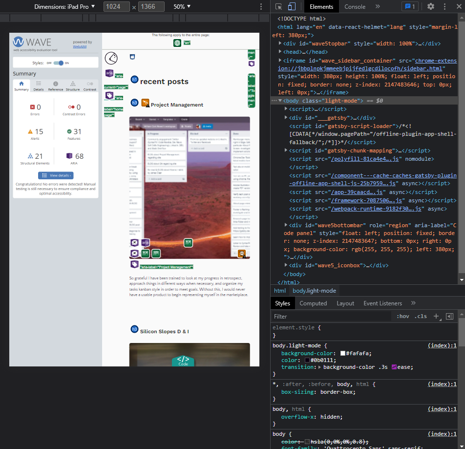
Chrome dev tools device toolbar and WAVE chrome extension by Clark Newell
TLDR: Manual testing, accessibility evaluations, unit testing and mock production builds will definitely reveal issues you didn’t even realize you had. This in turn creates a lot more cards or “tickets” on your kanban board, but it’s for the best because you definitely want to release the most presentable, useable, and accessible product possible.
During the development of my personal website, I implemented quality analysis during the process. A lot of manual testing was done using Chrome dev tools. In building the custom responsive grid with css, I constantly changed the screen size and utilized the device toolbar in mobile mode, to test all of the different dimensions and formats available. It was interesting to see how the website showed up in the many different size formats. Many adjustments were made to my responsive grid in order to get the best overall result from all viewports.
A lot of manual testing was done using Chrome dev tools. In building the custom responsive grid in CSS, I constantly changed the screen size and utilized the device toolbar in mobile mode, to test all of the different dimensions and formats available.
I fully realize that the device toolbar is simply an emulator and does not totally equate to using actual devices. Usually professional settings would include a "device lab" with the actual mobile hardware available for testing.
I do have a funny story about the dimensions of the Samsung Galaxy Fold. I was really annoyed by the super skinny dimensions of the folded viewport. My personal website looked terrible in it, and in this one, what I thought was an "edge" case, I shrugged it off. Then, I started seeing the Galaxy Fold out in the wild! I had customers show them to me physically and I asked them directly, do apps and websites look strange in the folded viewport and they said "no." So, if other developers are taking this super skinny viewport seriously, then so should I, and I made the proper CSS adjustments.
Another important part of the manual testing process was using the website on Windows Chrome, Edge and Firefox, Mac Chrome, Safari and Firefox, and on mobile Chrome, Safari and Firefox. This testing resulted in addressing issues with routing and layout that needed to be corrected.
As a side note, for fun and research purposes, audit your favorite websites with the WAVE accessibility evaluation Chrome extension!
I implemented a web accessibility evaluation tool from WAVE in the form of a Chrome extension to review my website. I highly recommend this tool since it’s very easy to use. As a side note, for fun and research purposes, audit your favorite websites with the WAVE extension! This initially revealed issues with color contrast and html / JSX syntax that had to be addressed. I added numerous aria labels as a result of the evaluation. The “aria-label” attribute is used to label an html / JSX element for aid with assistive technology. (Note: HTML used inside of a React component is considered "JSX "syntax.)
This highlights the ongoing dilemma between style and accessibility. Since this same element passes the accessibility evaluation in light mode, I weighed the pros and cons and allowed this stylistic feature to remain.
I had to change some design and color choices in order to meet the criteria of the accessibility evaluation, especially when it came to contrast. I have boldly decided to diverge from a strict header tag hierarchy by jumping from "h1" to "h3" for style purposes, but am open to reevaluating this if there is pushback. I do have several “noscript” tag alerts, which unfortunately cannot be avoided with images generated by Gatsby, as it is a static site generator serving up HTML. In the end, the evaluation and adjustments concluded with zero errors and zero contrast issues. There is one contrast issue with the footer in dark mode, however, I have left this design feature as the text contrast is meant to be intentionally harsh in this case. This highlights the ongoing dilemma between style and accessibility. Since this same element passes the accessibility evaluation in light mode, I weighed the pros and cons and allowed this stylistic feature to remain.
The next QA step that I implemented at this stage in the development of my website was testing with Jest. Some minimal Jest testing indicated the site builds as expected, however, I do have some opportunities to address in future with improved error handling. Jest is the preferred testing suite for React applications, and the Gatsby framework.
When building a website with Gatsby, there are options in the command line interface (CLI) that offer opportunities to ensure a proper build. One should exit development mode, then use the “gatsby build” command to build a mock production site and “gatsby serve” to view the build on the localhost:9000 port. This feature provides a Gatsby developer with a way to view the website in production before pushing the code to a host.
Manual testing, accessibility evaluations, unit testing and mock production builds will definitely reveal issues you didn’t even realize you had. This in turn creates a lot more cards or “tickets” on your kanban board, but it’s for the best because you definitely want to release the most presentable, usable, and accessible product possible, albeit with continuous improvements. To be honest, in the real world, minor defects are allowed to slide into production if the cost of correction impedes the release time goal and does not seriously affect the user.